.svg)
Chat Settings (Autocorrect)
The autocorrect feature is available in all types of OCP miniApps® and if enabled it automatically fixes misspelled words. You can also use a custom autocorrect application by entering its ID.
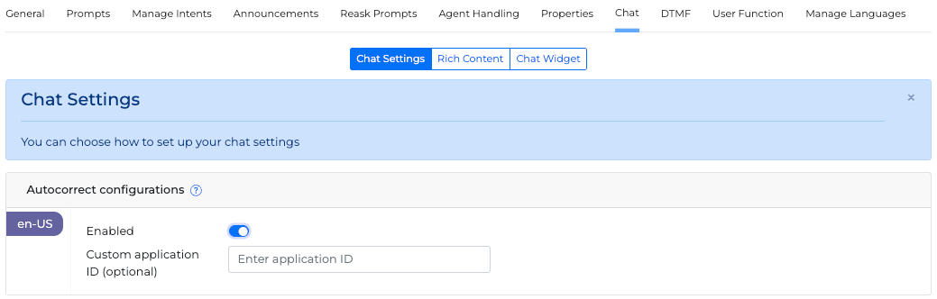
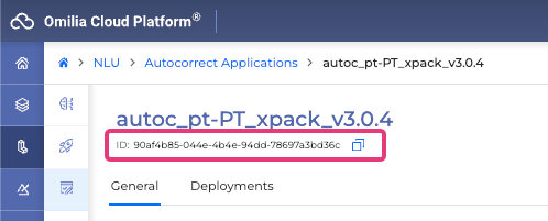
The Autocorrect Application ID can be copied from the NLU → Autocorrect Applications menu when selecting the required Autocorrect Application.
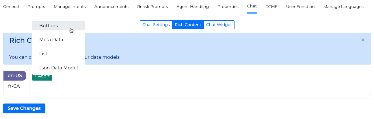
Rich Content
Below there are explanations about how to effectively utilize rich content (data models).
Rich content can be in the form of buttons, lists, selectable menus, calendars and other forms in the chat.
To select which type of rich content you want to create, click the +Add button and select the one you want from the list.
You can add more than one data models to a miniApp, however maximum two data models can be added to each prompt.
Click the +Add link to rich content button to add rich content to any of the following actions:
-
Initial Prompt (Prompts, Conditional rephrase)
-
Reask Prompts
-
Manage Intents (Intent Disambiguations, Intent Confirmations)
-
Announcements Meta Data Model
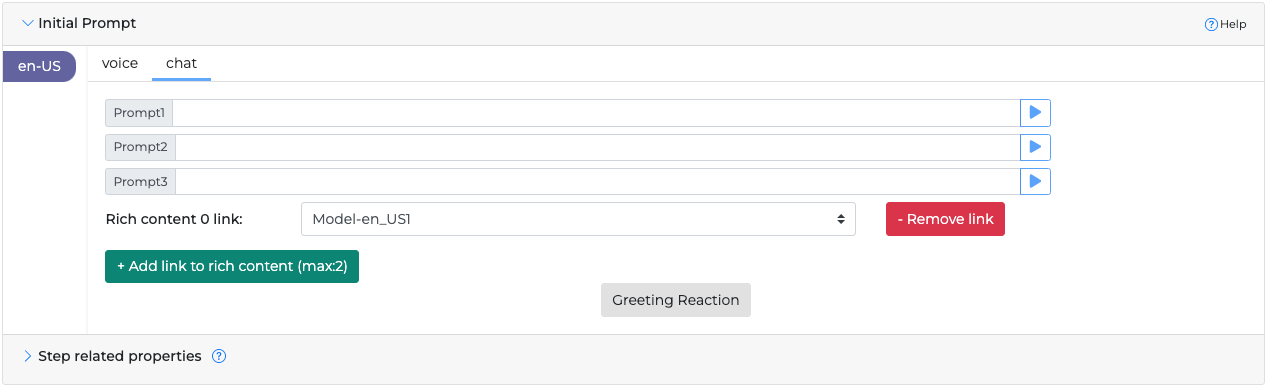
The data model must be selected in the Prompts tab in order to be applicable.
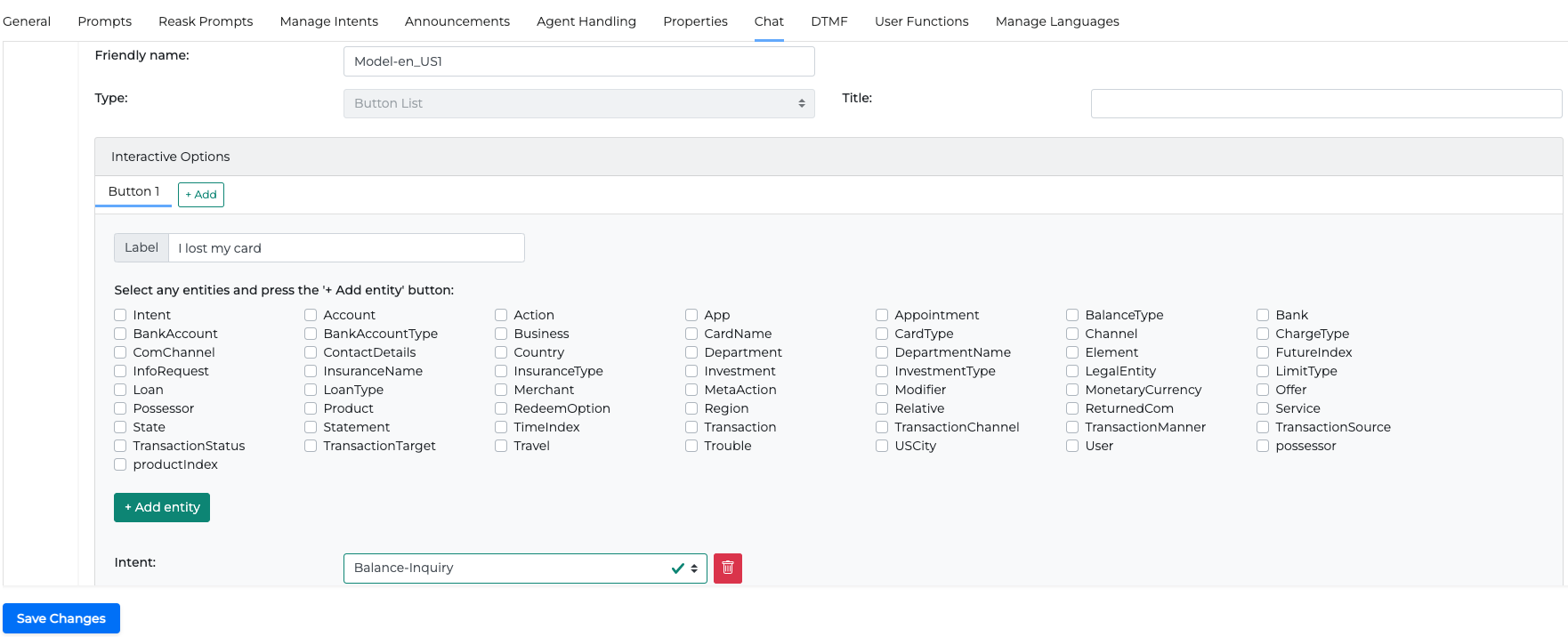
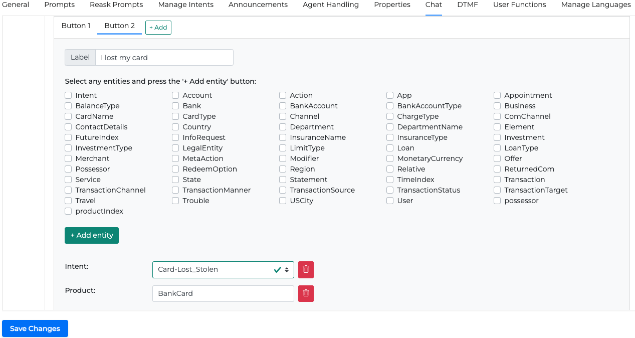
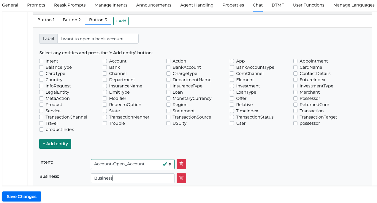
Buttons Data Model
The buttons data model will create a button selection in the chat that will direct the caller to specific choices. These can be popular chat inquiries.
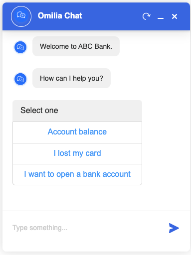
To add selection buttons to the chat, follow the steps:
1. Add the following details to a buttons data model:
-
Friendly name. This is how you can label your data model and later refer to it in any section that the +Add link to rich content button can be found (0 link is first, 1 link is second).
You can add rich content to any of the following actions:
-
Welcome Prompts (Prompts, Conditional rephrase)
-
Reask Prompts
-
Manage Intents (Intent Disambiguations)
-
Announcements
-
-
Title. The text header that will be seen by the user on top of the button list. (Optional)
2. Add the following details to the selected button:
-
Label. The actual text that will show on the button.
-
Entities. NLU entities, which will help you specify metadata for each button and get a more precise result based on what the user selects. This can either be a selected intent from the list of intents available in the miniApp or a selected entity. Select any entities from the list and click the +Add entity button to add them.
-
For Intent select one from the list.
-
For Entities add a text value.
-
You can add as many buttons and data models as you want, but you may only use two data models for the same prompt.
Examples of additional buttons are shown below.
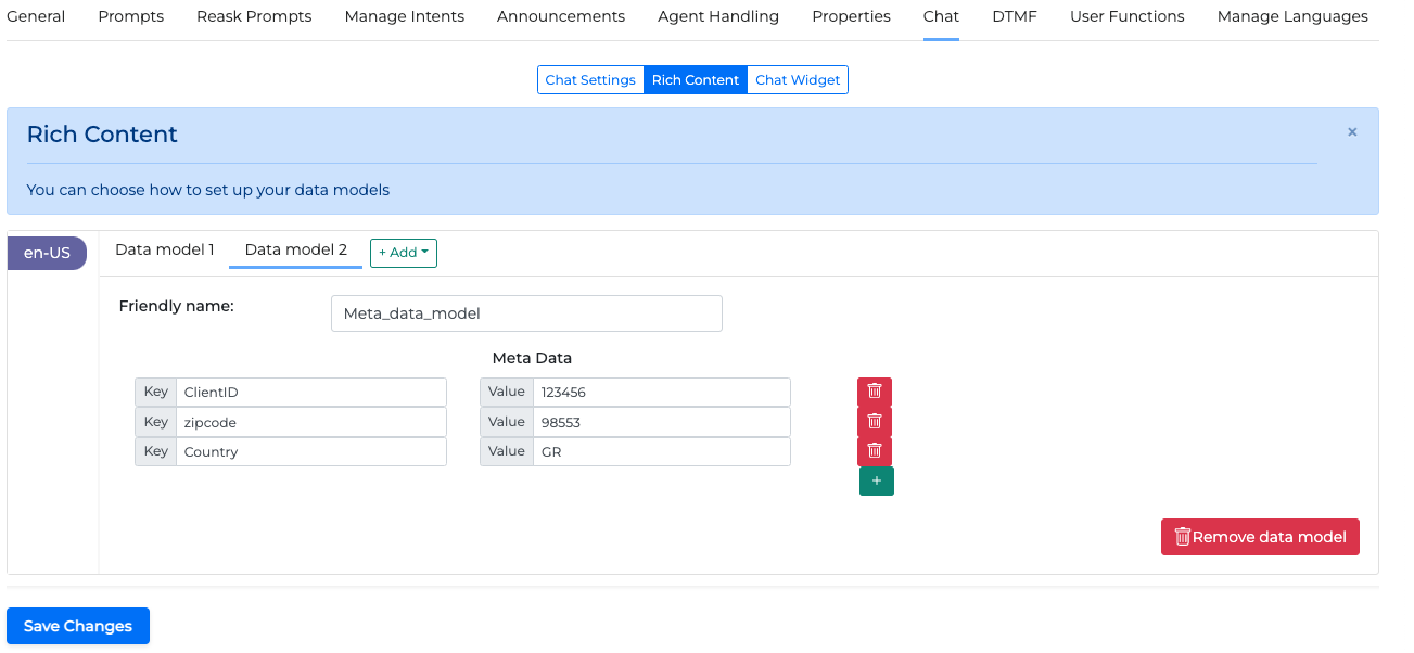
Meta Data Data Model
Metadata consists of custom key-value pairs that developers can configure to return to a specific dialog step. Although this content is not visible in the widget, the host website can retrieve it by implementing a callback JavaScript function within the widget's configuration.
The website developer can use these any way they see fit, for example, redirect, change DOM, and so on.
To add metadata from the chat, follow the steps:
-
In the Chat → Rich Content tab click the +Add button on the data models line and select Meta Data.
-
Add the following information in the new Data Model and save changes.
-
Friendly Name: This is how you can label your data model and later refer to it in any section where the +Add link to rich content button can be found.
-
Key: Set additional key values by clicking the + sign
-
Value: The value of the key. This value can be dynamic.
-
-
Add the corresponding rich content to any of the actions that can receive rich content:
-
Welcome Prompts (Prompts, Conditional rephrase)
-
Reask Prompts
-
Manage Intents (Intent Disambiguations)
-
Announcements
-
Adding MetaData at any stage of the chat sends the configured data as an event in the website’s JavaScript. This data can be exploited in any way found useful.
For more information on how to use metadata on the client side read Chat widget integration guide.
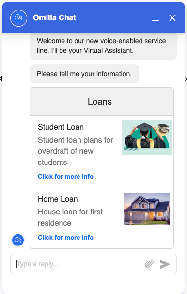
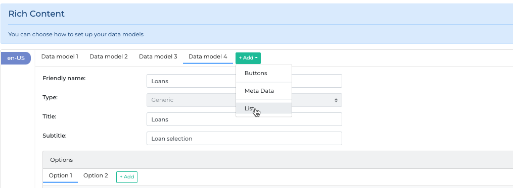
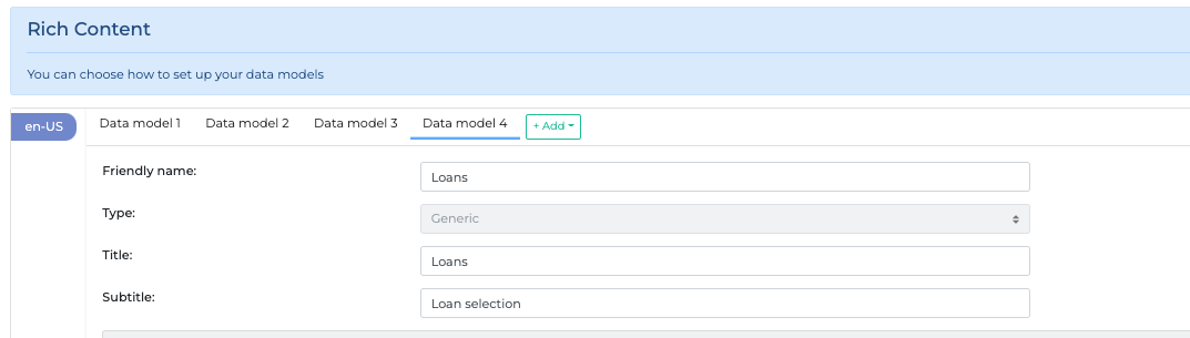
List Data Model
The List data model allows creating a list of boxes that can contain pictures, information, and clickable links that can redirect to your site or any external URL.
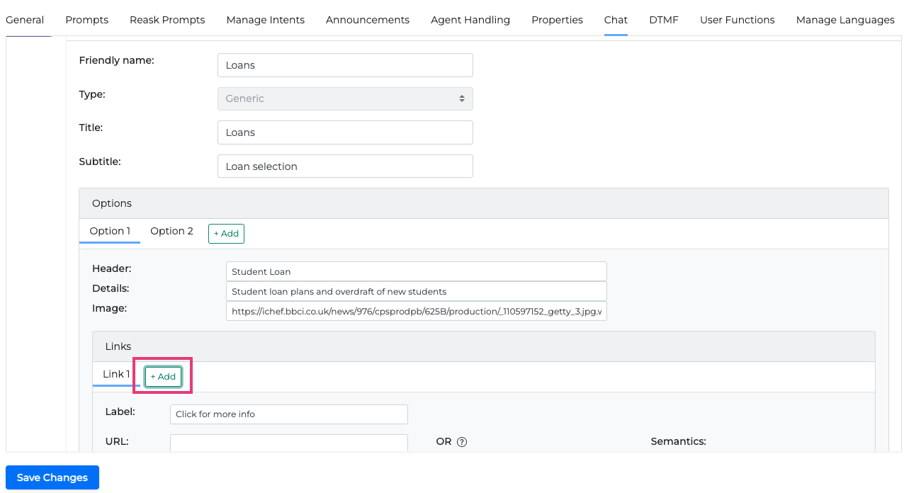
To add link data to a chat, follow the steps:
-
Click the +Add button on the data models line and select List:
-
Fill in the details of the data model. The Title and Subtitle will appear in the Chat in the corresponding box.
-
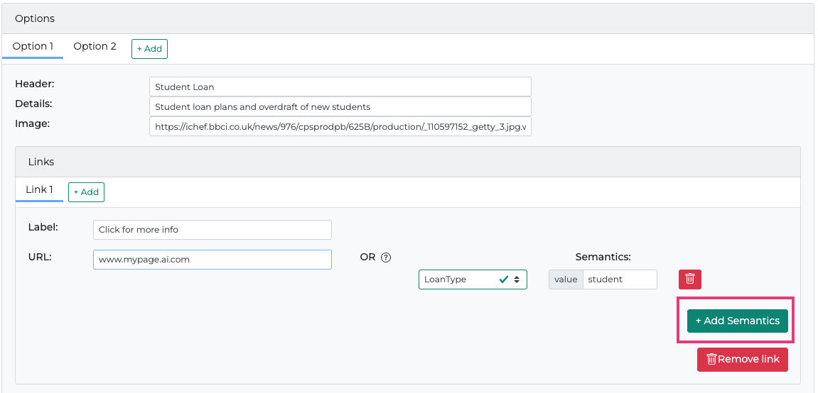
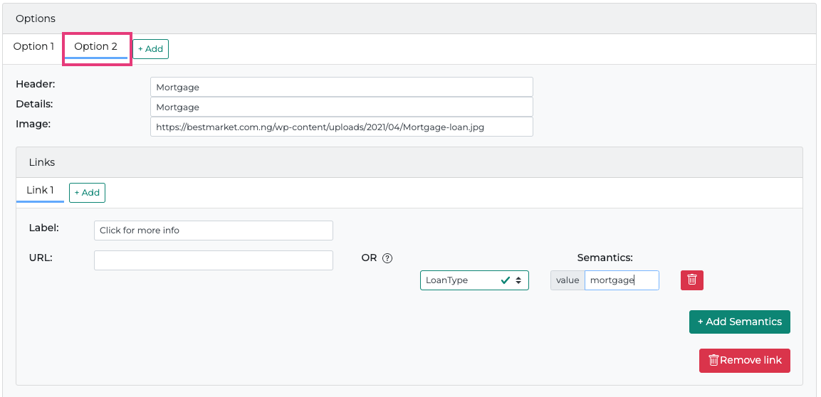
Click the +Add button on the options line and fill in the details of that option. Every data model can have several options. An option can be a product or a product category you offer. For example, if the data model concerns bank loans the options could be the loan types.
The info will be added to the corresponding box in the chat.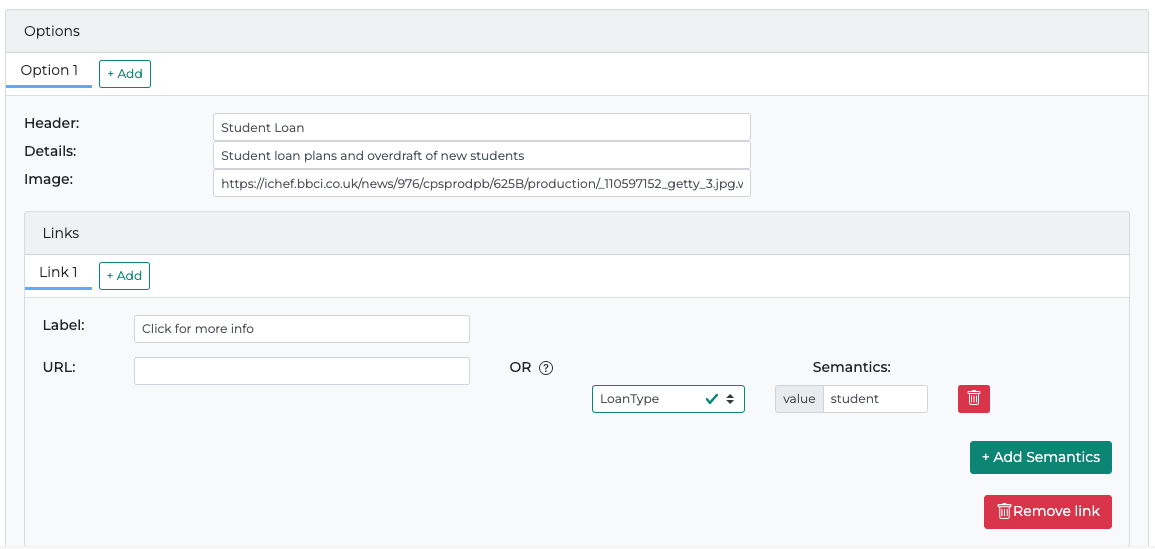
-
Click the +Add button on the links line to add a URL link to the chat in the box of Option 1. The link will appear in the corresponding chat with the text in the Label field. You can add several links if required by repeating the process.
-
Click the +Add Semantics button to add an entity from the list of entities or add a custom one. Fill in a semantic for that entity to complete this step.
-
Repeat steps 3 to 5 to create another option for the data model.
JSON Data Model
For an even more customized result, there is the option to create a JSON Data Model for the chat widget.
The JSON data model supports the following component types:
-
DATETIME - Can be used either as a date or a time picker.
-
BUTTONS - List of buttons.
-
FORM - Forms support INPUT and DROPDOWN components only.
-
INPUT - Text input, used inside forms only.
-
DROPDOWN - Used inside forms only.
-
-
ATTACHMENT - Add an attached file.
DATETIME
DATETIME can be used to select either a date or a time.
DATETIME cannot be placed inside a FORM.
Date Example
{
    "type": "DATETIME",
    "free_text_enabled": true,
    "with_calendar": true,
    "format": "dd-MM-YYYY",
    "submit_button_label": "Confirm",
    "semantics_key": "date",
    "validation": {
        "available_dates": [
            {
                "start": "2025-02-20",
                "end": "2025-02-25"
            },
            {
                "start": "2025-03-01",
                "end": "2025-03-10"
            }
        ]
    }
}
|
Property Name |
Type |
Description |
|
|---|---|---|---|
|
|
string |
Defines the type of the JSON Data Model. |
|
|
|
string |
semantics key for user input |
|
|
|
boolean |
When set to true, the user can also use the free text input box to provide their input. Otherwise, they can provide their input only through the rich content component. Default is true |
|
|
|
boolean |
Indicates that item is a calendar. Can be true only if |
|
|
|
boolean |
Indicates that item is a timepicker. Can be true only if |
|
|
|
string |
This will be used by the connector to construct the utterance that will show in the user's text bubble when a date is selected. If it is not set, the default will be set by the connector using |
|
|
|
string |
The label for confirmation button |
|
|
|
object |
The rules for the user input |
|
|
|
|
array |
Dates that are allowed to be selected in YYYY-MM-DD format. |
|
|
|
integer |
Time step in minutes for the time picker. Allowed values are: 1, 5, 10, 15, 20, 30
|
Widget output example
Time Example
{
    "type": "DATETIME",
    "free_text_enabled": true,
    "with_time": true,
    "format": "mm:hh",
    "submit_button_label": "Confirm",
    "semantics_key": "time",
    "validation": {
        "time_step": 15
    }
}
Widget output example
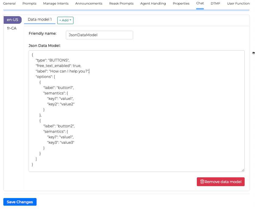
BUTTONS
This will create a list of buttons arranged horizontally.
BUTTONS cannot be placed inside a FORM.
Example
{
    "type": "BUTTONS",
    "free_text_enabled": true,
    "label": "Sellect one of the options",
    "options": [
        {
            "label": "Button 1",
            "semantics": {
                "key1": "value1",
                "key2": "value2"
            }
        },
        {
            "label": "Button 2",
            "semantics": {
                "key1": "value1",
                "key3": "value3"
            }
        },
        {
            "label": "Button 3",
            "semantics": {
                "key3": "value4"
            }
        }
    ]
}
|
Property Name |
Type |
Description |
|
|---|---|---|---|
|
|
string |
Defines the type of the JSON Data Model. |
|
|
|
string |
Specifies how buttons should be arranged. Allowed values are HORIZONTAL and VERTICAL. Default value is HORIZONTAL. |
|
|
|
string |
The label to display for buttons |
|
|
|
boolean |
When set to true, the user can provide their input |
|
|
|
array |
Options which will be represented as buttons |
|
|
|
|
string |
The name of the button |
|
|
|
string |
Key value |
Property free_text_enabled defines if the user is allowed to provide text response (if set to true) or forced to use the rich content for a response (if set to false). Default is true.
Widget output example
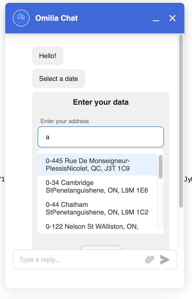
FORM
The rich content item that allows you to place inputs and dropdown list inside of it.
Currently, only INPUT and DROPDOWN fields are allowed.
Example
{
    "type": "FORM",
    "label": "Enter your data",
    "fields": [
        {
            "type": "INPUT",
            "label": "Full name",
            "semantics_key": "fullName"
        },
        {
            "type": "DROPDOWN",
            "label": "Preferred contact method",
            "semantics_key": "contactMethod",
            "options": [
                {
                    "label": "By phone",
                    "value": "phone"
                },
                {
                    "label": "By email",
                    "value": "email"
                }
            ]
        }
    ]
}
|
Property Name |
Type |
Description |
|
|---|---|---|---|
|
|
string |
Defines the type of the JSON Data Model. |
|
|
|
string |
The label to display as headline for the form |
|
|
|
array |
Fields of the form. Can be either DROPDOWN or INPUT |
|
|
|
boolean |
When set to true, the user can provide their input |
|
|
|
string |
The label for submit button |
|
Widget output example
INPUT
Input is a type of form field which allows users to type their input.
Example
{
    "type": "INPUT",
    "label": "First name",
    "required": true,
    "value": "Name",
    "placeholder": "Type your name here",
    "error_message": "error",
    "semantics_key": "firstName",
    "validation": {
        "regex": "^[A-Za-z\s]+$",
        "min_length": 5,
        "max_length": 20
    }
}
Input specific Properties
|
Property Name |
Type |
Description |
|---|---|---|
|
|
boolean |
When property |
|
|
string |
Contains the pre-filed value for input |
|
|
string |
Used to specify under which semantics key the selected value will be extracted. |
|
|
string |
Contains a message that will be displayed if the input to the field doesn’t pass validation. |
DROPDOWN
The dropdown component allows the user to type in order to filter the contents of the dropdown. This can be static or use autocomplete.
Example:
{
    "type": "DROPDOWN",
    "label": "Enter your data",
    "required": false,
    "value": { "label": "bbb", "value": "222" },
    "error_message": "error",
    "semantics_key": "lastName",
    "options": [
        { "label": "aaa", "value": "111" },
        { "label": "bbb", "value": "222" }
    ]
}
Dropdown specific Properties
|
Property Name |
|
Type |
Description |
|---|---|---|---|
|
|
boolean |
When property |
|
|
|
array |
Contains the pre-filed value for input |
|
|
|
|
string |
Label to be displayed by widget |
|
|
|
string |
Value to be extracted |
|
|
string |
Is used to specify under which semantics key the selected value will be extracted. |
|
|
|
array |
Each item there should have a |
|
|
|
|
string |
Label to be displayed by widget |
|
|
|
string |
Value to be extracted |
Widget output example
DROPDOWN with autocomplete
It has almost the same structure as dropdown with static options, the only difference is that instead of options it has autocomplete configuration.
Example
{
    "type": "DROPDOWN",
    "label": "Address",
    "semantics_key": "addressId",
    "required": true,
    "placeholder": "Chose your address",
    "value": {
        "label": "Some address",
        "value": "ADRESS_ID"
    },
    "autocomplete": {
        "type": "JMESPath",
        "headers": {
            "Referer": "${ocpHost}"
        },
        "method": "GET",
        "url": "http://example.autocomplete.api/AddressComplete/SearchTerm=${userUtterance}",
        "options_path": "Items[].{value:Id, label:join('',[Text || '', Description || ''])}",
        "body": "The user typed: ${userUtterance}",
        "search_term": "userUtterance"
    }
}
Dropdown with autocomplete specific Properties
|
Property Name |
|
Type |
Description |
|---|---|---|---|
|
|
boolean |
When property |
|
|
|
array |
Contains the pre-filed value for input |
|
|
|
|
string |
Label to be displayed by widget |
|
|
|
string |
Value to be extracted |
|
|
string |
Is used to specify under which semantics key the selected value will be extracted. |
|
|
|
array |
Each item there should have a |
|
|
|
|
string |
The type of expression. Only JMESPath is supported |
|
|
|
string |
The placeholder |
|
|
|
string |
The API method |
|
|
|
string |
The URL path |
|
|
|
string |
Contains an expression for extraction of necessary information |
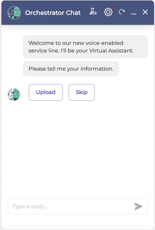
ATTACHMENT
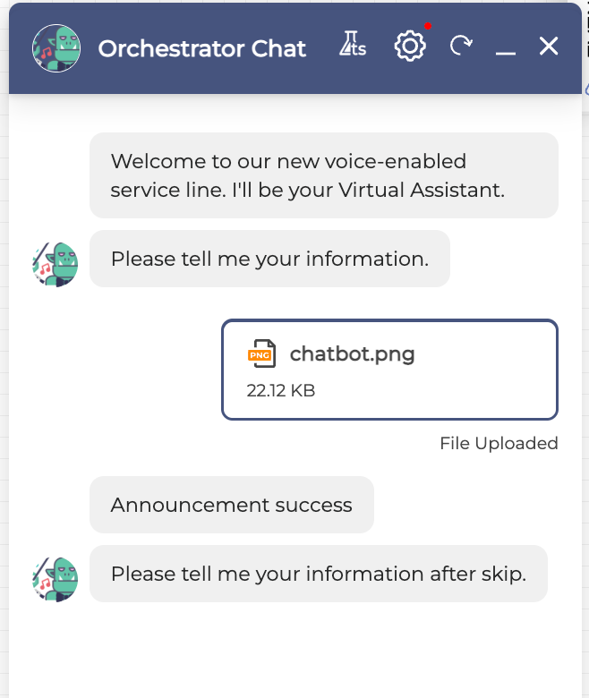
You can use the attachment data model to enable the user to upload files (for example, claim documents, screenshots) to the bot before an agent transfer. It uploads files and attaches them to the case ID for agents to review and reduce handling time. The feature is configurable (file size, count) and active during specific pre-transfer bot dialogues. Also several supported file types can be configured (for example, .jpg, .png, .pdf, .doc and so on).
Example with Salesforce
{
"definition": {
    "attachment_type": "salesforce",
    "base_url": "https://mockserviceservicewithtimeout322493.mock-eu.blazemeter.com/attachments",
    "access_token": "{{ocpvars:token}}",
    "api_version": "v44.0",
    "case_id": "{{ocpvars:caseId}}"
  },
  "max_attachments": 32,
  "max_size": 1048576,
        "free_text_enabled": true,
  "types_allowed": ["image/jpeg", "image/png", "application/pdf", "text/plain", "application/zip"],
  "submit_button_label": "Upload",
  "skip_button_label": "Skip",
  "input_field_name": "userUploadAttachment",
  "semantics_key": "Text",
  "cancel_button_label": "yo. skip",
  "attachment_timed_out_utterance": "yo time out"
}
Example with single request
{
  "definition": {
      "method": "POST",
      "url": "https://mock-eu.blazemeter.com/attachments",
      "headers": {
        "Authorization": "Bearer {{accessToken}}",
        "Content-Type": "application/json"
        },
        "body": "{\"title\":\"${filename}\",\"name_of_file\":\"${filename}\",\"content\":\"${file_content_base64}\"}"
     },
  "max_attachments": 8,
  "max_size": "5MB",
  "types_allowed": [
       "image/jpeg",
       "image/png",
       "application/pdf",
       "text/plain",
       "application/zip"
     ],
  "submit_button_label": "Upload",
  "skip_button_label": "Skip",
  "semantics_key": "attachments",
  "cancel_button_label": "cancel"
}
|
Property |
Type |
Description |
|---|---|---|
|
|
string |
Maximum number of attachments allowed |
|
|
string |
Maximum size permitted for attachments |
|
|
string |
List of allowed file types for upload (e.g., "png", "pdf") |
|
|
string |
The label for the submit button in the UI for uploading |
|
|
string |
The label for the button to skip the upload step |
|
|
string |
A key for semantics or use in processing logic |
|
|
string |
A label for the cancel button |
|
|
string |
A prompt for a when a preset timeout happens during the upload request |
Widget output example
In the above example with Salesforce the dialogue will evolve as shown below.
-
Buttons option appears to select to Upload an attachment or Skip to the next part of the flow.
-
In the next step where you can Drag & Drop files or Browse through your files to select one to upload, or Cancel the upload
-
Once the attachment is uploaded the dialogue will continue to the next step of the flow as configured
Chat Widget
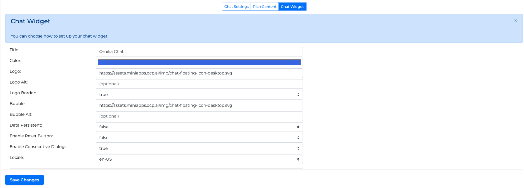
In the Chat Widget tab, you can configure how the chat window itself will look. Configure any of the following:
-
Title: The title of the chat
-
Color: The color of the font
-
Logo: The picture appearing on the top of the chat
-
Bubble: The picture appearing as a chat icon
-
Locale: The phoneme for the chat
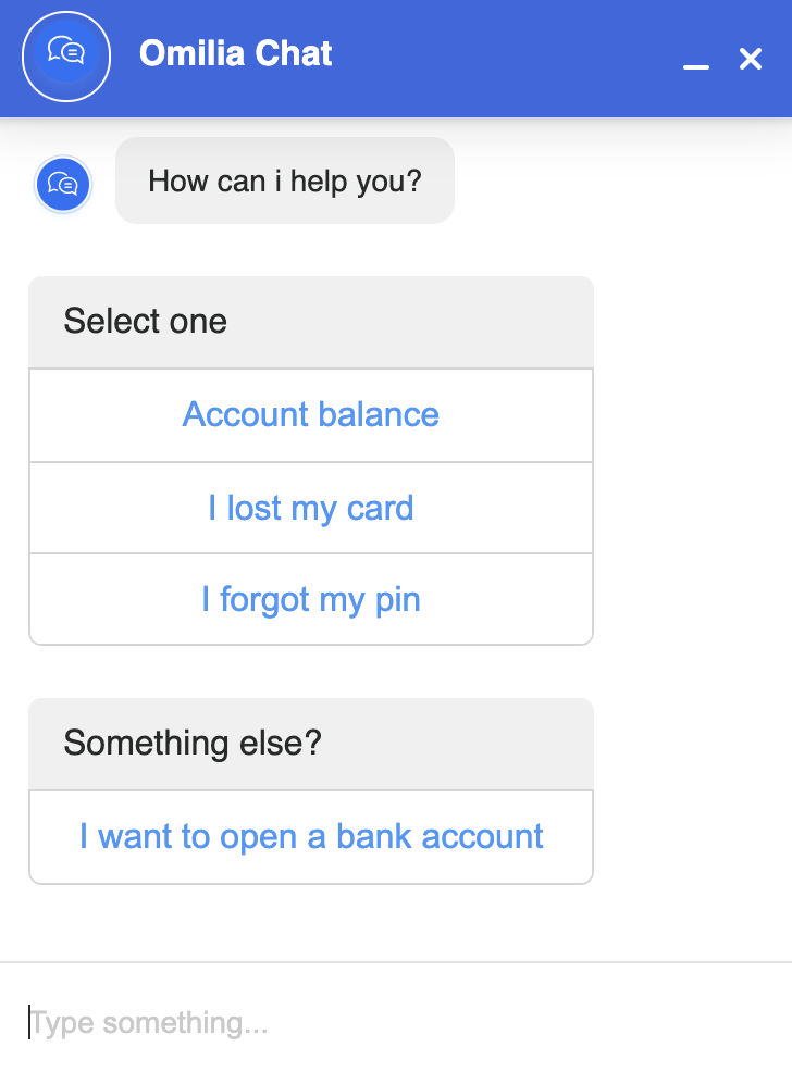
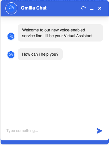
With the configurations described in this article, the resulting widget will look as follows:
Embed Chat widget to a website
To embed the Chat widget to your website:
-
Click the enable <<Locale>> button.
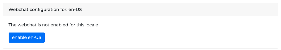
2. Copy the Javascript code with the Copy button and paste it to your website’s HTML code. Otherwise copy only the API key from the JS code.
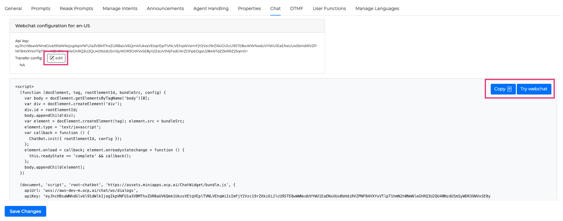
Test Webchat
Click the Try webchat! button to test the webchat.
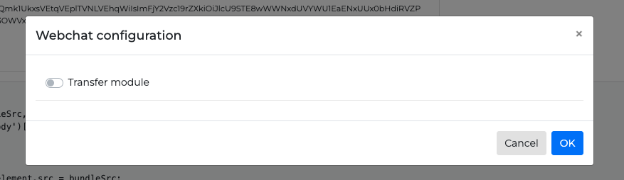
Edit the Webchat Transfer module configuration
Click the edit button to open the Webchat configuration.
-
Click the Transfer module toggle button to on to open the configuration options. The configuration options are different depending on the Type selection.
-
Select the Transfer module Type (CFront, InContact, Talkdesk, or Salesforce)
In Contact Transfer Module
If InContact is selected the following options are available:
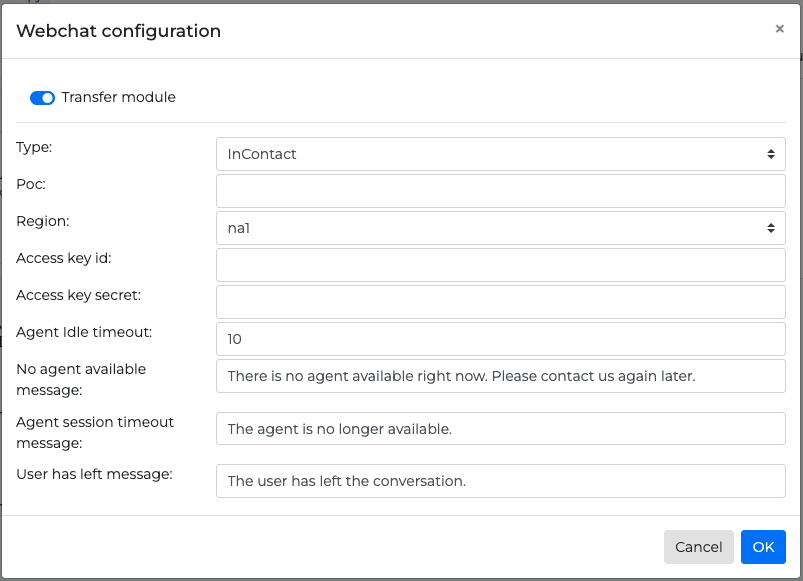
-
Poc: NICE point of contact, NICE queue ID.
-
Region: The region your application is based
-
Access key id: NICE access key ID
-
Access Key secret: NICE access secret key. This should be encrypted the same way the
api_secretin the tenants table is encrypted. -
Agent idle timeout: The maximum amount of time (in minutes) without receiving any new agent message. After that the conversation gets terminated. Zero value means no timeout.
-
No agent available message: Displayed to the user when we fail to start a transfer to NICE for any reason
-
Agent session timeout message: Displayed to the user when the agent has not responded after the set
Agent idle timeoutperiod has passed -
User has left message: Displayed to the agent when the user has left the conversation
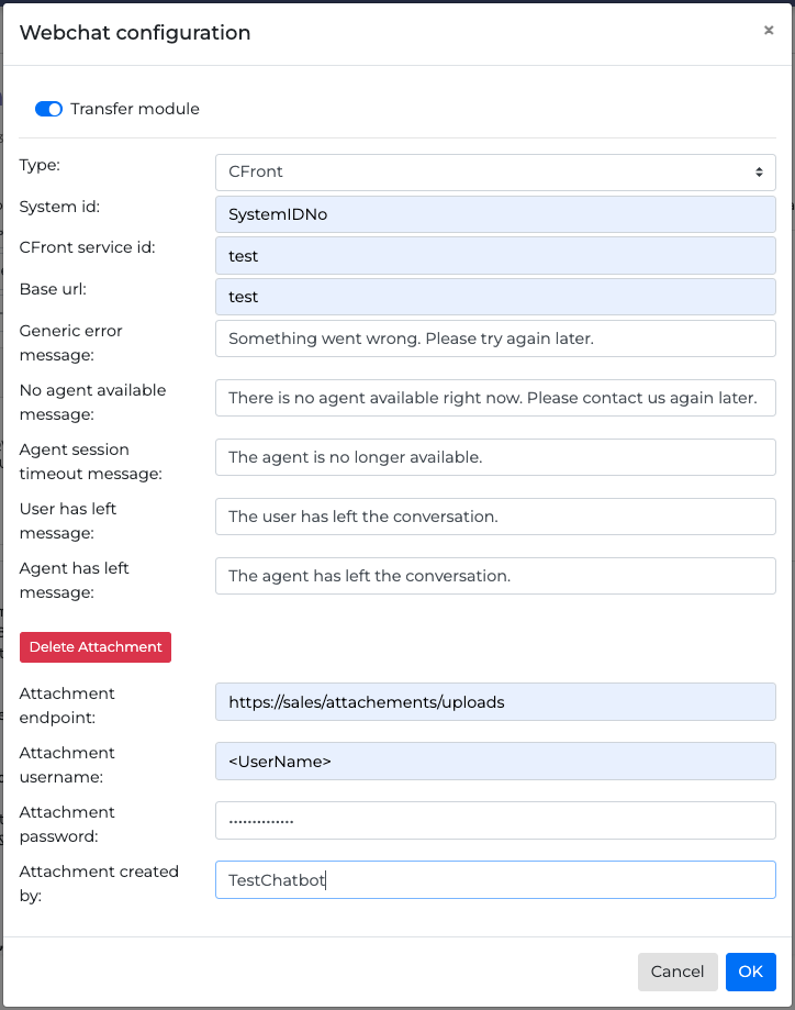
CFront Transfer Module
If CFront option is selected the following options are available:
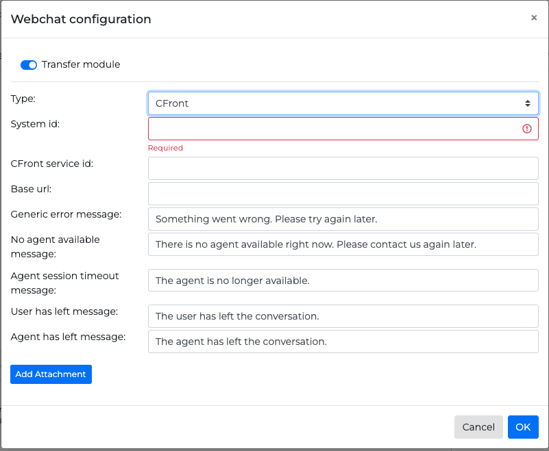
-
System id: CFront API key, it allows access to the CFront API
-
CFront service id: CFront queue id
-
Base url: CFront API URL
-
Generic error message: Message when an unexpected error has occurred
-
No agent available message: Displayed to the user when there is no available agent at that time
-
Agent session timeout message: Displayed to the user when the agent has not responded after a period has passed
-
User has left message: Displayed to the agent when the user has left the conversation
-
Agent has left message: Displayed to the user when the agent has left the conversation
-
Add Attachment: Required if the endpoint provided uses base 64 for authentication. The end-user can attach there the following information:
-
endpoint: The endpoint of the service
-
username: The username
-
password: the base 64 password
-
created by: This field is optional
-
Talkdesk Transfer Module
If Talkdesk option is selected the following options are available:
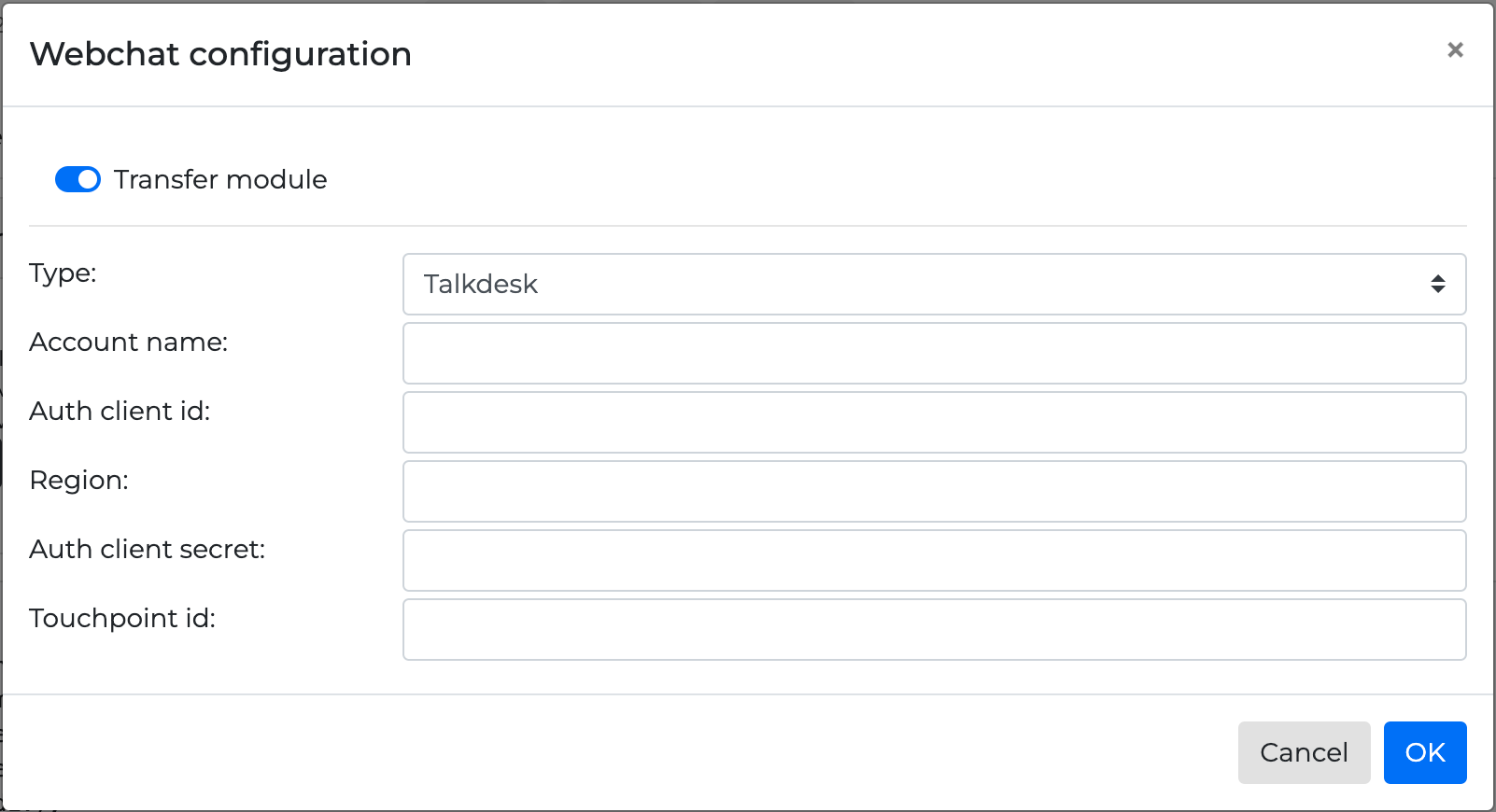
-
Account name: Talkdesk account name
-
Auth client id: Talskdesk authentication client ID
-
Region: Account and API region. Accepted values - EU, CA, US
-
Auth client secret: Talkdesk Authentication Client Secret. Encrypted with encryption key using AES256
-
Touchpoint id: Talkdesk touchpoint ID
Salesforce Transfer Module
If Salesforce option is selected the following options are available:
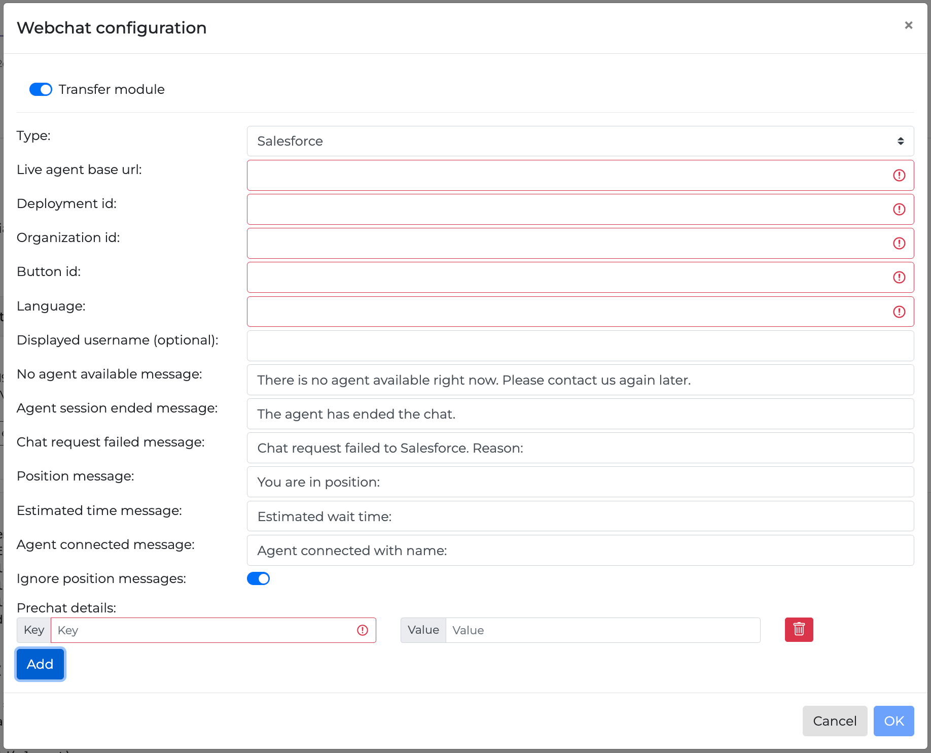
-
Live agent base url: The root web address (URL) used by your application or system to connect with a live agent service
-
Deployment id: The deployment ID number as defined by Salesforce
-
Organization id: The organization ID number as defined by Salesforce
-
Button id: A unique identifier for a button that you add to a page layout
-
Language: The selected language
-
Displayed username (optional): An optional username
-
No agent available message: A message displayed in case there is not an agent available
-
Chat request failed message: A message displayed in case chat is not available
-
Position message: The agent position
The toggle button Ignore position messages can make the position information not visible if turned on.
-
Estimated time message: An estimated time message that automatically informs customers about the estimated wait time before they are connected to a service representative
-
Agent connected message: A customized message shown when an agent connects to the chat
-
Prechat details: Defined key-value pairs. These refer to the information gathered from customers before a chat session begins. This information can be used to personalize the chat experience and provide better service
The following fields can be dynamically populated using OCP Flow variables, instead of being limited to constant values:
-
deployment_id -
organization_id -
button_id -
language -
displayed_username
Example:
"button_id": "{{OCP_Varible_1}}"
Replace OCP_Variable_1 with the name of the applicable OCP Flow variable. This approach ensures your integration is flexible and can adapt to different scenarios or user contexts at runtime.
For more information on how to embed a chat widget in your website read the Chat widget integration guide.