.svg)
This guide explains how to use the new Chat Widget configurator in OCP Integrations. The configurator centralizes widget setup in a dedicated Chat Widget area, replacing the older configuration approach from the miniApp Chat tab and providing fuller configuration coverage with live preview support.
Use this guide when you want to configure how the web chat widget looks, behaves, and is embedded on your website.
The configurator stores nothing; no server-side save and no browser storage. Reloading the page loses the entire configuration.
Generate and copy the script before you navigate away.
Overview
The Chat Widget configurator lets you prepare a web chat experience before embedding it into a website. In general, you will use it to:
-
Adjust the widget’s visual identity and branding,
-
Define how agent and bot profiles appear to end users,
-
Control interaction behavior and session handling,
-
Configure notifications and footer content, and
-
Generate the script needed to place the widget on a website.
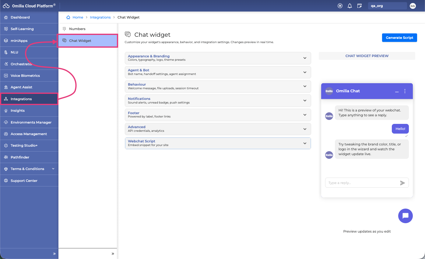
Based on the product rollout, WebChat widget configuration has moved to a dedicated Chat Widget tab in the Integrations section of the OCP Console. The legacy miniApp Chat tab is being simplified and retained mainly for locale-based key generation, transfer configuration, and Try WebChat actions.
Before you begin
Before configuring the widget, make sure you have access to the Chat Widget area in OCP Integrations and the required connection details for your deployment.
You will typically need:
-
an API URL for the WebChat service,
-
an API key for the target locale or environment,
-
Branding assets such as logos, bubble icons, agent images, or bot images, and
-
A target website where the generated script will be embedded.
It is preferable to use the API URL-based delivery of the widget so that new versions are received automatically. Using a downloaded chat file can lock you to a specific version and prevent automatic updates.
UI tabs and features
Appearance and Branding
This tab controls the overall look and feel of the chat widget. It is where you align the widget with your brand so that it feels native on your website.
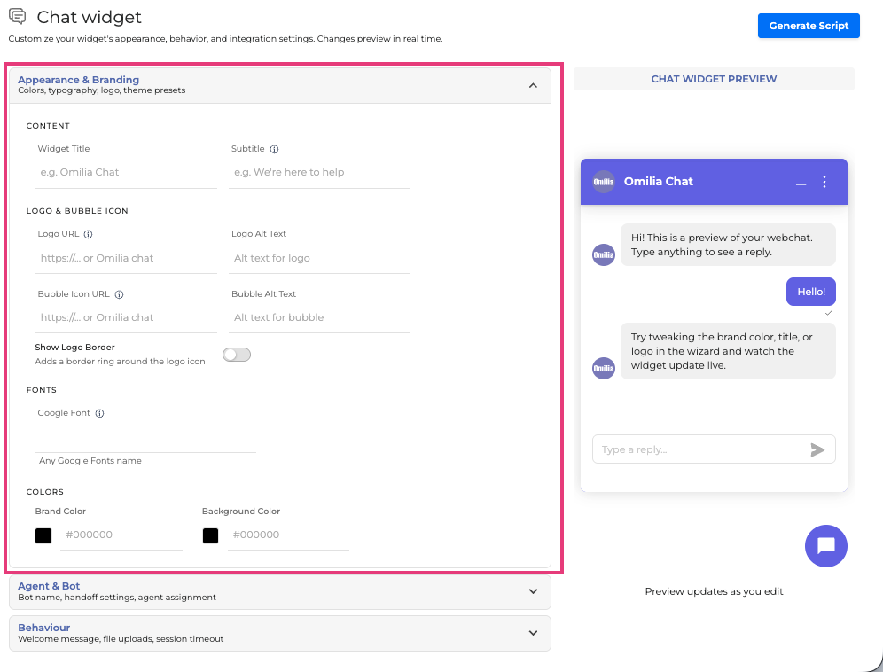
Common options in this area include:
-
Content: Main content configuration
-
Widget title: the main header text shown at the top of the widget.
-
Subtitle: supporting text under the main title.
-
-
Logo & Bubble Icon:
-
Logo: the brand image displayed in the widget header and, in some cases, also as the conversation avatar when no separate agent or bot avatar is set.
-
Logo alt text: accessibility text for the logo image.
-
Logo border: Toggle whether the logo is displayed with a border or not.
-
Bubble icon: the launcher icon users click to open chat.
-
Bubble alt text: accessibility text for the bubble icon.
-
-
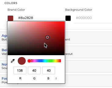
Colors: Select the color theme of the widget. Select a hex code, or click on the color icon to select RGB code or any color from the palette.
-
Brand color: the primary theme color used across the widget.
-
Background color: the chat window background color.
-
-
Font: A font family to match your website style.
-
Google font: Add any Google font. Used when generating the embed script.
-
Best practice: keep the widget title short, choose a brand color with strong contrast, and use clear alt text for all images to improve accessibility.
Important details:
-
The subtitle has a maximum length of 22 characters.
-
Logo and bubble image assets should be valid paths or Base64-encoded assets.
-
Referenced logo assets are expected to be suitable for small UI display.
Agent and Bot
This tab defines how human agents and the bot are presented in the conversation UI. It helps users understand whether they are interacting with automation, a live agent, or both.
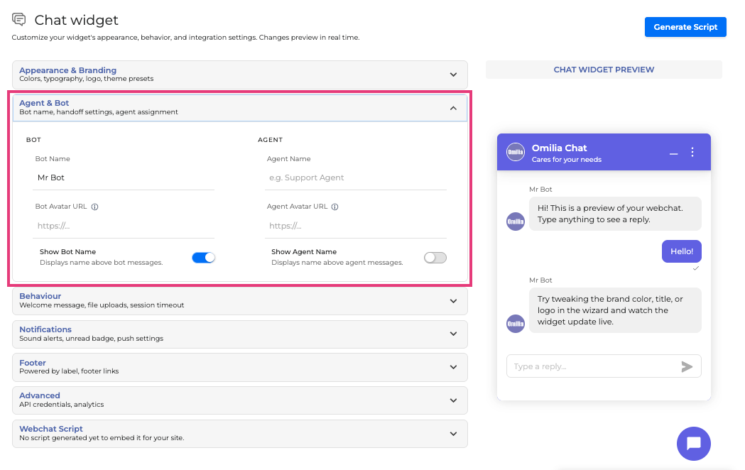
You can configure separate profiles for agent and bot, including:
-
Name: the display name shown in the conversation.
-
Show name: whether the name is visible to the end user.
-
Avatar: an image representing the agent or the bot.
This is useful when:
-
you want a branded bot identity,
-
you want live-agent handoff to feel more personal, or
-
you want to clearly distinguish bot messages from agent messages.
If agent or bot avatar settings are provided, the widget logo is primarily used in the header rather than also serving as the default conversation avatar.
Behaviour
This tab controls how the chat behaves during and after conversations. These settings affect user experience, continuity, and session management.
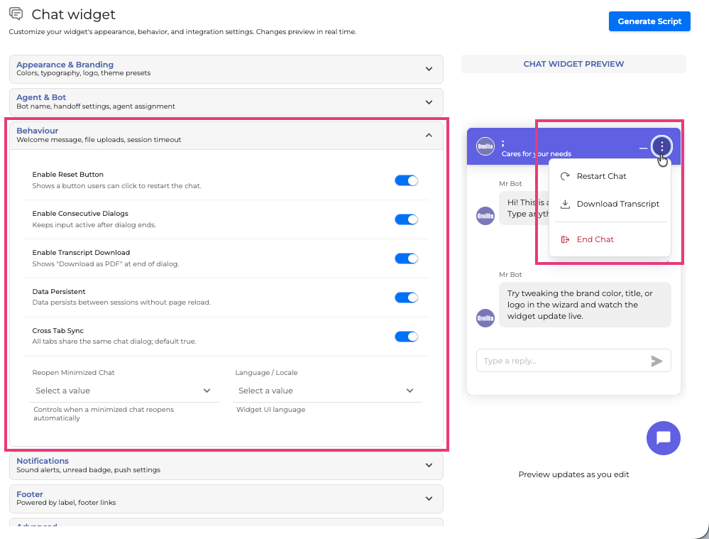
Typical behaviour-related options include:
-
Reset button: enables a button that restarts the chat by calling the Restart Chat action.
-
Consecutive dialogs: when enabled, users can continue typing after a dialogue ends; when disabled, the input becomes inactive until the chat is restarted.
-
Transcript download: enables downloading the conversation transcript as a PDF at the end of a dialogue from the Download Transcript option in the chat menu.
-
Data Persistent: Data persists between sessions without page reload.
-
Cross-tab sync: determines whether different browser tabs share the same conversation.
-
Reopen minimized chat: controls whether a minimized widget automatically reopens across navigation, reloads, or new tabs.
-
Locale: the language used by the widget interface, such as English or French
Examples of practical use:
-
Enable cross-tab sync when users commonly navigate across multiple pages during a support session.
Be thoughtful with session-related settings. Features like consecutive dialogs and cross-tab synchronization can affect how startup data and semantics persist across sessions and browser tabs.
Notifications
This tab configures how the widget alerts users about unread messages.
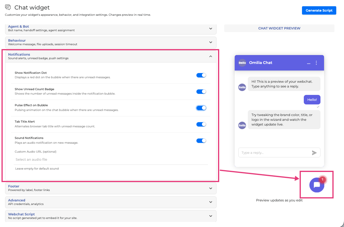
Available notification options include:
-
Show Notification Dot: A notification dot next to the chat bubble indicates that there are new messages.
-
Unread count: Shows the number of unread messages. (Requires Bubble indicator on)
-
Pulse effect: Animates the chat and notification bubbles to attract attention. (Requires Bubble indicator on)
-
Browser tab title alerts: Alternates the page title to indicate new messages.
-
Sound Notifications: Plays a notification sound as soon as message is received
-
Custom audio source: lets you define a custom sound file instead of the default sound.
These settings are especially helpful when the widget is minimized and users may not otherwise notice incoming replies.
Recommended setup:
Enable the bubble indicator and unread count first, then add sound or pulse effects only if they fit the customer experience and brand tone.
Footer
This tab manages the text and branding shown at the bottom of the widget.
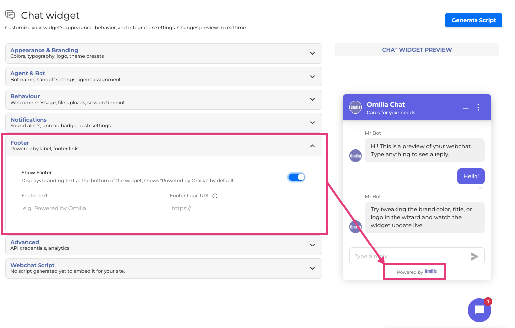
Typical footer options are:
-
Show footer: enables footer display.
-
Footer text: custom text shown in the footer.
-
Footer logo URL: optional image displayed in the footer.
If the footer is enabled but no custom text or logo is provided, the default footer content may be shown.
Common uses include:
-
adding company or department branding,
-
showing a trust message or service label, or
-
displaying a partner or program logo.
Advanced
This tab includes settings used for deeper customization, integration behavior, and data handling.
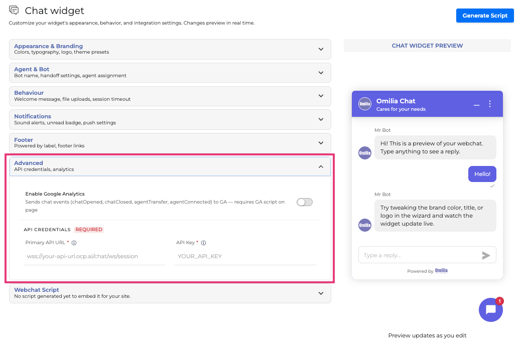
Common advanced capabilities include:
-
Google Analytics integration - to track widget events.
-
Primary API URL - The server URL the widget connects to. Find it in the OCP Console: open your miniApp, go to the Chat tab, enable a Locale, click “Get JS Code” and note the
apiUrlvalue in the code snippet. Chat Tab | Embed Chat widget to a website -
API Key - Add the API key for authentication and to link the correct miniApp and dialogue configuration.
.
Only send data that is necessary for the conversation experience. Complex nested objects and arrays are not supported in the initialization data object.
Webchat Script
This tab provides the script required to embed the configured widget into a website. After configuration is complete, click the Generate Script button, copy the generated JavaScript snippet and paste it into your website’s HTML, preferably near the end of the body.
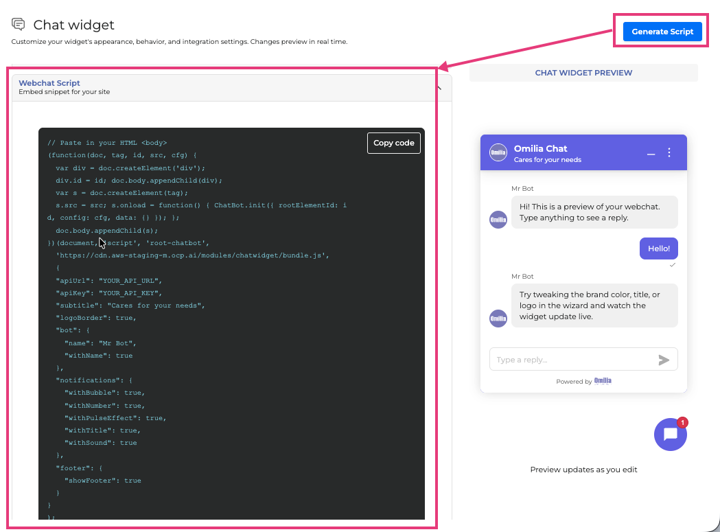
Example Webchat Script:
// Paste in your HTML <body>
(function(doc, tag, id, src, cfg) {
  var div = doc.createElement('div');
  div.id = id; doc.body.appendChild(div);
  var s = doc.createElement(tag);
  s.src = src; s.onload = function() { ChatBot.init({ rootElementId: id, config: cfg, data: {} }); };
  doc.body.appendChild(s);
})(document, 'script', 'root-chatbot',
  'https://cdn.demo.ocp.ai/modules/chatwidget/bundle.js',
  {
  "apiUrl": "YOUR_API_URL",
  "apiKey": "YOUR_API_KEY",
  "title": "Omilia Chat",
  "subtitle": "We are here to help",
  "logoUrl": "https//logourl",
  "logoBorder": true,
  "agent": {
    "name": "Agent Mike",
    "withName": true
  },
  "bot": {
    "name": "BotMike",
    "withName": true
  },
  "enableResetButton": true,
  "enableConsecutiveDialogs": true,
  "enableTranscriptDownload": true,
  "dataPersistent": true,
  "crossTabSync": true,
  "shouldReopenMinimizedChat": "ALWAYS",
  "notifications": {
    "withBubble": true,
    "withNumber": true,
    "withPulseEffect": true,
    "withTitle": true,
    "withSound": true
  },
  "footer": {
    "showFooter": true
  }
}
);
You can also extend the script with configuration values such as title, logo, brand color, notifications, footer settings, agent and bot details, and advanced behavior settings.
If your site uses a modern web framework such as Angular Universal, load the bundle script in the document head and initialize the widget from the application component.
Recommended configuration flow
-
Open the Chat Widget configurator in OCP Integrations.
-
Complete Appearance and Branding to match the customer website.
-
Set up Agent and Bot identities.
-
Adjust Behaviour for the desired conversation experience.
-
Enable only the Notifications that fit the customer experience.
-
Add optional Footer content.
-
Review Advanced options for integrations, persistence, tracking, and startup data.
-
Copy the generated code from Webchat Script.
-
Embed the script into the target website.
-
Use the available preview or test option to validate the final result.
Best practices
-
Keep branding consistent with the host website, but avoid overloading the widget with too many visual elements.
-
Use clear titles, concise subtitles, and recognizable icons.
-
Show bot and agent names only when they improve clarity for the user.
-
Enable transcript download and feedback only when they support the use case.
-
Test behavior across multiple tabs and page reloads if cross-tab sync or reopen settings are enabled.
-
Verify notification sound and visual effects in the customer’s browser and accessibility context.
-
Prefer automatic delivery through the API URL to stay current with widget updates.